
From closures as design statements to refill as the default: how the industry is reading this year's packaging in Florence
Pitti Fragranze 2026: What the Bottles and Caps Reveal About Where Niche Perfumery Is Heading
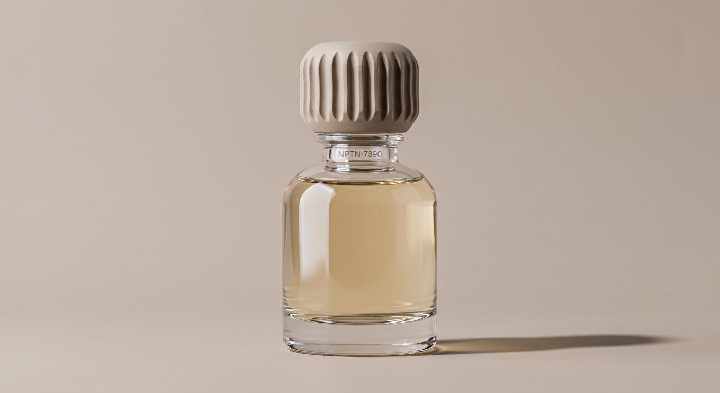
Pitti Fragranze wrapped its 24th edition on September 11–13 at the Stazione Leopolda in Florence, bringing together more than 260 niche perfumery brands, roughly 75% of them international. This year's theme, “Cura” (care), showed up in the packaging in a very concrete way: in how bottles — and especially caps — are being designed.
We don't make the fragrance or name the launch, but we make a large part of what sits around the bottle: caps, labels and accessories. That's why a fair like this matters to us even though we don't sell direct to consumers — it's a solid read on where perfumery packaging design is heading, and what brands will be asking for next.
The Cap Stopped Being Just a Closure
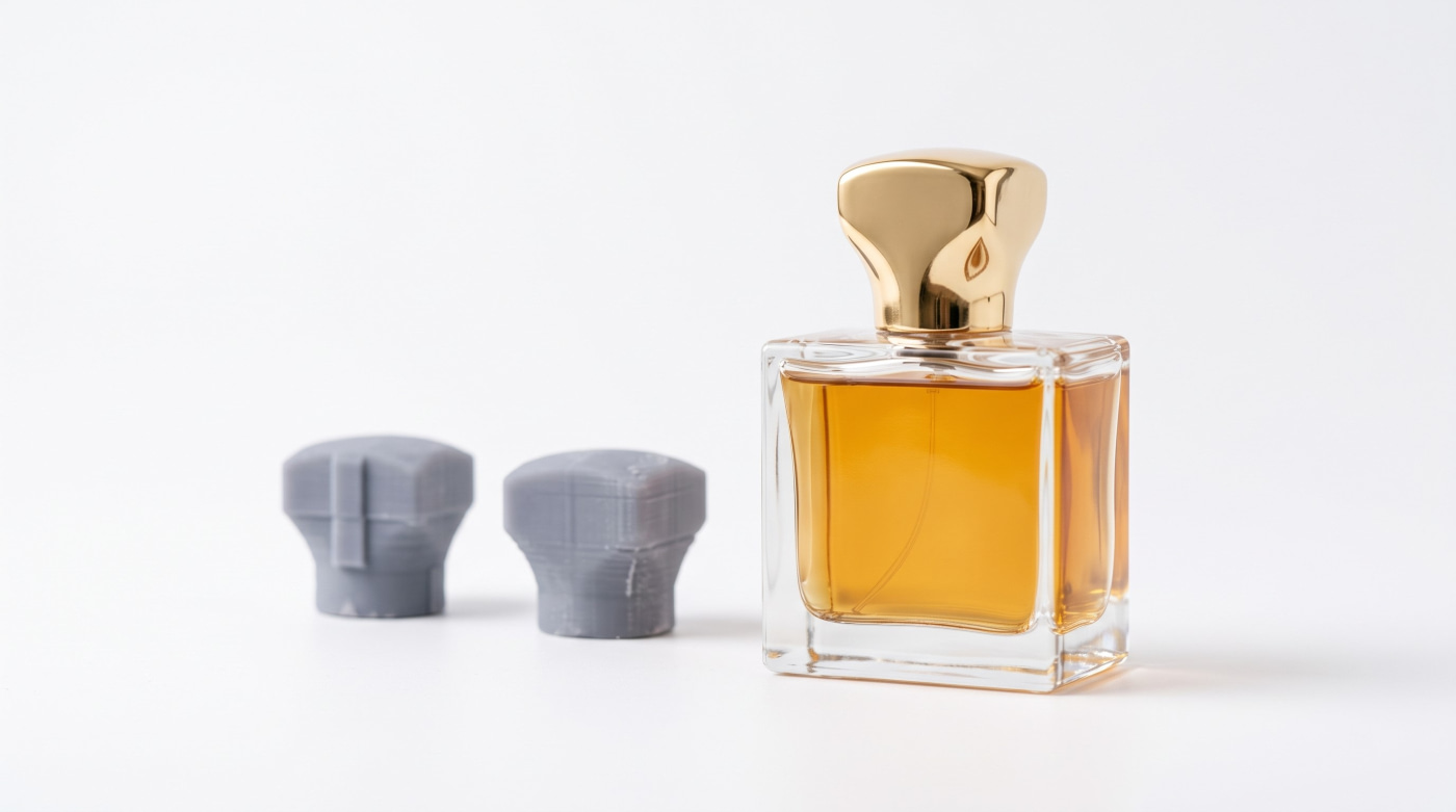
One of the clearest signals from this edition is how much weight the cap now carries in the overall bottle design. It's no longer just about sealing well — the cap is where a lot of a fragrance's personality lives: the material, the finish, how it sits against the bottle body. Special guest designer Niccolò Pasqualetti had his bottle and packaging developed with a specialist Italian manufacturer working alongside artisans — one more sign that niche perfumery brands are trusting dedicated packaging partners with this piece, rather than treating it as an afterthought.
In practical terms, that means paying attention to cap weight, how it opens and closes, and keeping spray output consistent shot after shot — details you won't spot in a product photo, but that a customer notices the moment they pick the bottle up.
Refill Is Becoming the Default, Not the Exception
The second clear takeaway is that refillable packaging has moved from being a one-off gesture for sustainability-minded brands to something planned in from the first sketch. That means treating the cap, sprayer and bottle neck as one system: standardized threading, closures that come apart without tools, and materials that don't complicate recycling once the pieces are separated.
For manufacturers of caps and accessories, that changes the brief: a good-looking piece is no longer enough — it also has to assemble, disassemble and reassemble without losing fit or finish.
Minimalism and Sculpture, Side by Side
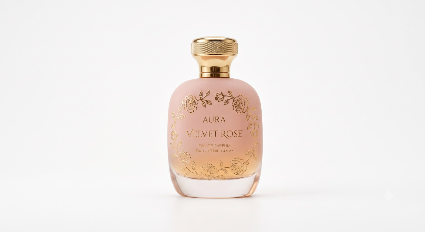
Walking the fair, the sharpest contrast is between two design languages that coexist without friction: rounded, minimalist bottles with smooth, matte caps on one side; far more sculptural pieces on the other, with textures — frosted glass, ribbing, wood or ceramic — designed so the cap is recognizable by touch alone, no label needed.
Both approaches demand the same level of manufacturing precision: an even matte finish in series is just as hard to get right as a ribbed texture free of mould defects. The difference is in the story the brand wants to tell, not in how complex it is to produce.
What This Means for Us
Bottles, caps, labels and accessories: at Ataviance we make sure every packaging component arrives coordinated, without you juggling several suppliers. That's the part of the bottle we work on, in both glass and plastic. If you're defining the packaging for a new launch and want the cap to be part of the design rather than just a closure — or reviewing the refill system on an existing line — let's talk.
Contact us here