
What to lock in from the start, what can change from one fragrance to the next, and which glass finishes do the work.
One bottle, a whole fragrance line: how to plan it
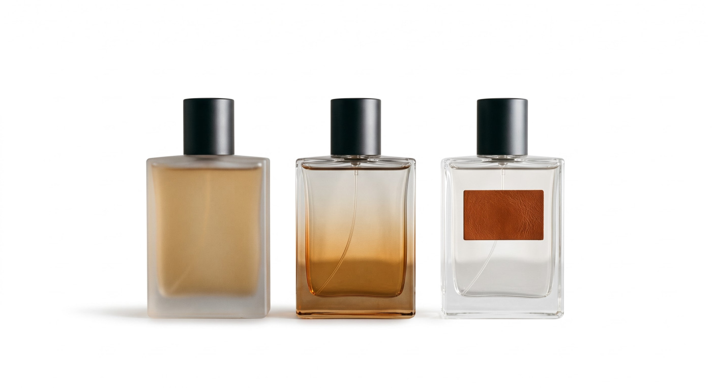
When a brand is working on its second or third fragrance, the same question tends to come up: a new bottle, or the one we already have? More and more brands keep the shape and change everything else. It works well, but only if it's planned from the start rather than improvised with each launch. Here's what we look at when a project goes that way.
First, decide what stays the same
The bottle shape is the obvious one, but it isn't the only thing worth locking in. Capacity, neck finish and pump should stay the same too, because they decide whether every other component fits the same way each time. If each fragrance uses a different pump, the cap and collar have to be adapted every time, and the line loses consistency in the part people touch most.
It also helps to fix the position and size of the brand name. If it's always in the same place, the eye finds it even when the colour of the bottle changes completely.
Choosing a bottle that can carry several versions
Not every bottle works equally well as the base for a line. Flat faces or gentle curves take screen printing, labels and hot foil without trouble; heavily faceted shapes limit where and how you can decorate.
The base matters too. A thick glass base adds weight in the hand and reads very differently depending on the finish: it shines in clear glass and almost disappears under an opaque lacquer. Before you commit, picture the bottle in the most extreme colours you plan to use.
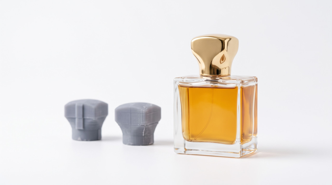
And the shape needs enough personality to be recognisable on its own, without being so dominant that every new colour looks forced. Starting from a catalogue bottle is common for this kind of project: the shape is already proven, and the work goes into the decoration, which is what will give each fragrance its own look.
The finishes that give each fragrance its own look
Frosting
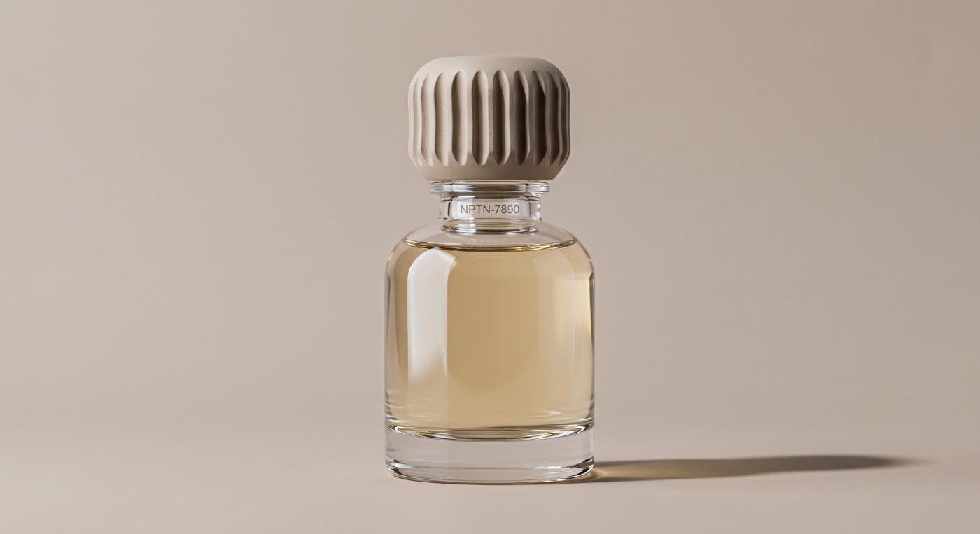
Frosting takes the shine off the glass and leaves it soft to the touch. There are two ways to get it: acid-etching the glass surface or applying a frosted lacquer. They look similar, but lacquer lets you add colour in the same step.
Lacquering and gradients
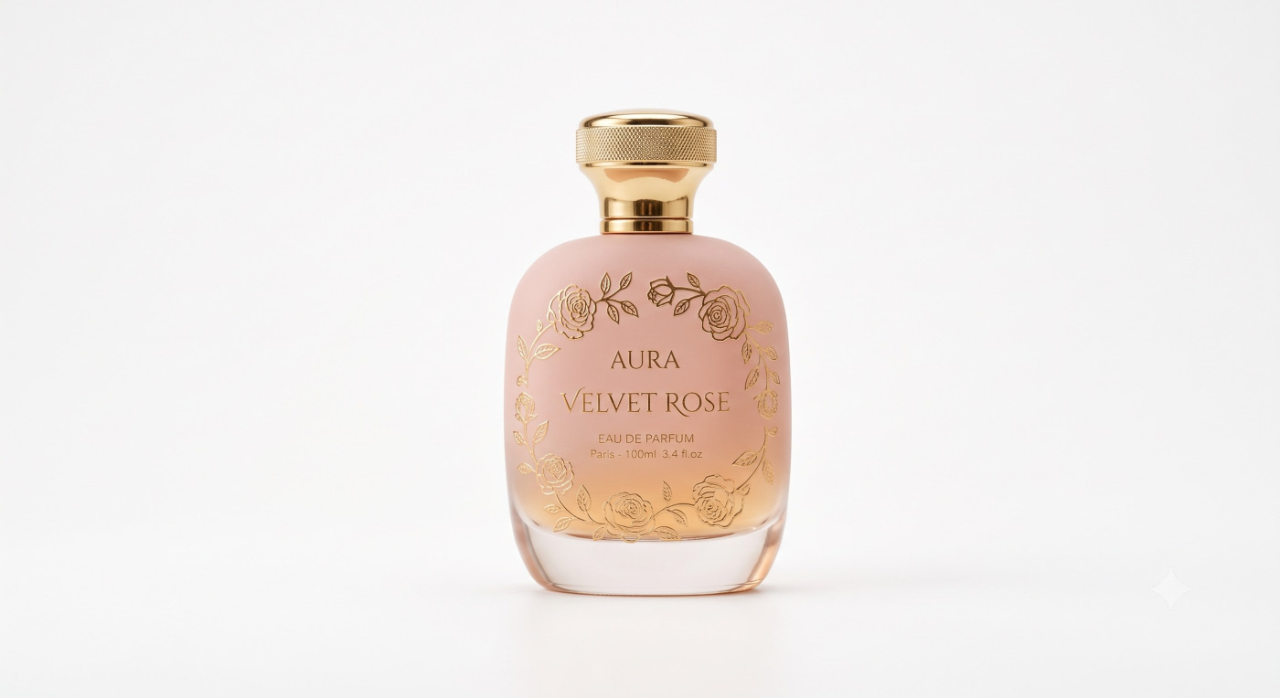
Lacquer coats the bottle in colour — gloss, matte or satin — anywhere from a translucent tint that shows the juice to fully opaque. Gradients use the same technique, with the colour building towards the base or the shoulder. If you want each fragrance to have its own colour without touching the shape, this is the most direct route.
Metallisation
A gold, silver or copper finish changes the bottle's character entirely. It's often kept for a special edition or for the most intense fragrance in the line, the one that needs to stand out from the rest.
Screen printing and hot foil stamping
These handle text and graphics: the fragrance name, a motif, a fine line. Screen printing lays ink on the glass; hot foil transfers a metallic film with a shine ink can't match. In a line, the usual approach is to keep the layout and change the ink or foil colour for each fragrance.
Labels, caps and accessories
Not everything has to happen on the glass. An aluminium, leather or fabric label changes how the bottle feels in your hand and can vary from one fragrance to the next without touching anything else. The same goes for the cap: the same model in a different finish or colour is already enough. And a charm or a custom accessory can be what marks out a limited edition within the line.
Labels and accessories have a practical advantage as well: they go on after the bottle is decorated, so they usually leave a little more room to adjust details towards the end of the process.
Staying consistent from one launch to the next
The hard part of a line usually isn't the first fragrance. It's the fourth. A few common industry practices make a real difference.
Keep an approved sample of every colour and finish. Lacquers and inks can vary slightly between production runs, and a physical reference is what lets you compare properly.
Test every colour with the fragrance inside. Tinted glass changes how the juice looks, and a translucent lacquer can look very different over a light or a dark liquid.
Think about light. Tinted or opaque glass protects the fragrance better than clear glass, which is worth weighing for more delicate formulas.
And write everything down: bottle reference, finish, ink, label, cap and pump for each version. When the next launch comes round, your starting point is already there.
A line is designed as a whole
Reusing a bottle is still design work; the effort just moves somewhere else. The shape carries the identity, and the finish, label and details give each fragrance its place in the line. Every packaging piece — bottle, cap, label, accessory — leaves Ataviance already designed to fit the rest.
If you're planning a line, or the next fragrance in one you already have, get in touch. We can go through it with samples in hand and prepare 3D renders of each version before anything goes into production.
Contact us here